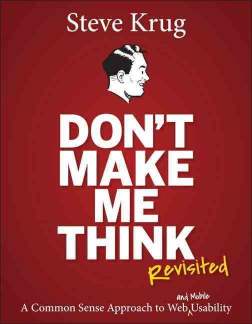
Review of "Don't Make Me Think"
By Eric — — 2 minute readSteve Krug's Don't Make Me Think is a quick, easy to read introduction to usability, especially as it relates to web design.

Some sections are very web-specific, but you'll also find plenty of things that apply to any kind of user interface. He also doesn't try to be comprehensive, often referring the reader to other sources in order to dig deeper into some subjects.
While I was reading this, my team at work has been laying the groundwork for a new ambitious project. I was surprised to occasionally find comments in the book that were relevant to things happening on my team unrelated to usability.
For example, "...developers tend to like complexity. They enjoy figuring out how things work, reverse engineering them in their head, and looking for ideas they can use." That is so true. It can be just as dangerous in architecture as in user interface design to let complexity run free.
We've also been trying to incorporate the idea of "ubiquitous language" from Domain Driven Design, making this statement from the book pop out: "All kinds of things on a Web page can make us stop and think unnecessarily. Take names, for example. Typical culprits are cute or clever names, marketing-induced names, company-specific names, and unfamiliar technical names." We're still struggling with names -- coming up with them and getting people to use them uniformly.
There's a section in the book titled "The antidote for religious debates". That's a pretty ambitious subject, but in the context of UI, he asserts that there is really only one way to settle such questions: usability testing.
"Where debates about what people like waste time and drain the team’s energy, usability testing tends to defuse most arguments and break impasses by moving the discussion away from the realm of what’s right or wrong and what people like or dislike and into the realm of what works or doesn’t work."
Now if only there were such an objective way to test the choice of programming language or coding standards...
The chapter on usability testing was one of the most useful to me. Early in my career I spent some time in a full-blown usability testing lab with a two-way mirror, multiple cameras, etc. Steve says it doesn't have to be such a big (and expensive) deal, and gives great advice about testing simply but effectively. I thought the explanation was pretty good, but Steve refers readers to another of his books if you want more, Rocket Surgery Made Easy.
I loved this bit of advice after discovering a usability problem: "Resist the impulse to add things. When it’s obvious in testing that users aren’t getting something, the team’s first reaction is usually to add something, like an explanation or some instructions. But very often the right solution is to take something (or some things) away that are obscuring the meaning, rather than adding yet another distraction."