Three Suggestions for the Android Calendar App
By Eric — — 1 minute read1. Two reminders
I want a reminder at the specified reminder time, and another one at the appointment start time. This is how it typically goes for me:
PHONE: Ding!\ ME: Oh yeah, I've got that meeting in 10 minutes. Let me just finish this little bit of code in the meantime...
(15 minutes later)
CO-WORKER VIA IM: Hey, you coming to this meeting?\ ME: Shoot! Sorry! Be right there.
The lack of this feature has created a market for tons of reminder "nag" apps that try to make up for it. I don't really want a whole other app that piles on inane features in an attempt to justify its existence, though.
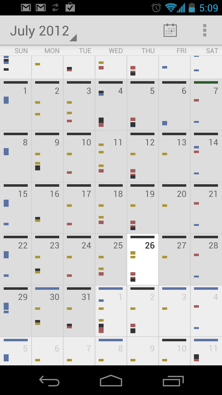
2. Current month is white
OK, this is kind of picky, but shouldn't the current month be white while the previous and next months are gray? The current scheme is opposite that and my brain struggled with it.

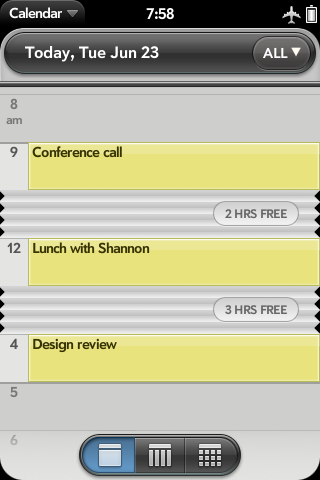
3. Combined day and agenda view
The webOS calendar has a brilliant combination of an agenda and day view. It lets you see all of your appointments without huge swaths of blank screen pushing them out of view, but still makes it easy to add a new appointment at any time of day by tapping the accordion section.
