Articles tagged with User Interface

UI Horror: Login... Again

By Eric

I use Office 365 with the web version of Outlook at work. At some point, I'll notice that the browser tab has changed appearance, and click on it to find that I've been logged out. No worries, there's a prompt right there for my password to renew my session. Soon …
Read more...

UI Baffler: Outlook Reminders

By Eric

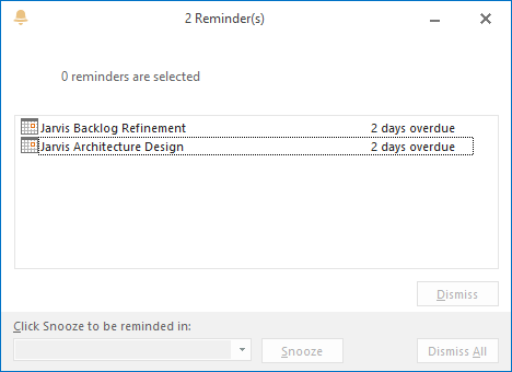
Why is it that in the Outlook reminders dialog, the "Dismiss All" button is disabled if there are no reminder items selected?

Dismiss All disabled

Well clearly it is because that button is supposed to dismiss all of the selected reminders, right?

No, because if there is any selected reminder, clicking "Dismiss All …

Read more...

UI Gem: Android Calendar Time Picker

By Eric — 1 minute read

It's been available for a while now, but every time I use the new Android calendar app's time controls, I'm so impressed by their elegance.

Previously, setting the time for a calendar event involved some simple numeric up/down spinners. Setting the hour worked reasonably well, but if your event …

Read more...

UI Horror: Windows 8 BSOD

By Eric

My PC is sad. I know this because of the frowny face. Unfortunately, I know not much more, because my PC won't boot, and Microsoft decided to provide as little information about the error as possible on their new BSOD screen.

Hmm... scary (but potentially useful) hexidecimal-laden error messages or …

Read more...

Three Suggestions for the Android Calendar App

By Eric — 1 minute read

1. Two reminders

I want a reminder at the specified reminder time, and another one at the appointment start time. This is how it typically goes for me:

PHONE: Ding!\ ME: Oh yeah, I've got that meeting in 10 minutes. Let me just finish this little bit of code in …

Read more...

UI Horror: Untrimmed Validation

By Eric

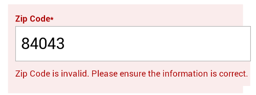
Hmm... this zip code looks pretty good to me.

Validation Error

This was on the Discount Tire mobile site. It's awesome that you can schedule a service appointment on the web using your mobile phone. It's not so awesome that the form validation doesn't compensate for the trailing space that my phone's …

Read more...

UI Horror: No-Paste Password Fields

By Eric

Sure, it makes sense to disallow copying passwords from a password field, but disabling pasting is just being annoying.

News flash for developers doing this (such as Intuit, in TurboTax): I'm not thrilled about manually typing my 20 character random password. Just let me copy it from my password vault …

Read more...

MessageBox: Just Say Nein

By Eric — 1 minute read

The Windows MessageBox is really convenient to use. A single line of code gets you a dialog box with a caption, a message, an icon and a set of available buttons that cover a lot of possible input scenarios. Unfortunately, the text on the buttons is supplied by the system …

Read more...

It's Just UI

By Eric — 3 minute read

Maybe I've just imagined this -- created my own straw man to take down -- but I've sometimes sensed some disparagement of user interface programming. "It's just UI," the architect will say. "It's not like it's a hard or interesting part of the system." As I've done more and more UI development …

Read more...

Transparent WinForms Label

By Eric — 2 minute read

Easy control transparency isn't exactly a hallmark of Windows Forms. If you have a form with a background image or a gradient, the stock controls paint with a solid background to give a criminally egregious aesthetic.

If you search the web for a solution, you might come up with a …

Read more...